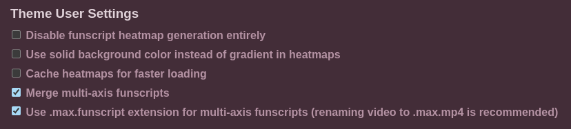
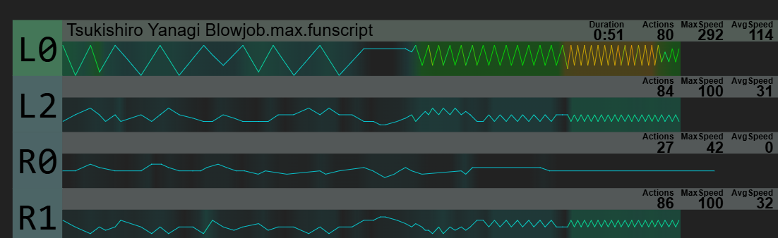
Currently, the “Use solid background color instead of gradient in heatmaps” option uses black text on top of a non-opaque background. This works great for light themes, but the contrast is significantly reduced when using dark ones.
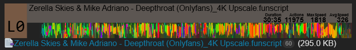
Browsing scripts around the site, I noticed that in those conditions the contrast ratio of the black text on top of the semi-transparent background fails basic contrast checks for small text, hovering around a ratio of 2.78~3.04 to 1 (a ratio of least 4.5:1 would be ideal).
Either increasing the opacity of the background or inverting the text from black to white would solve this issue on dark themes.
I should make a disclaimer: I don’t partake in using the automatically generated heatmaps, so it doesn’t affect me specifically - my job is one where user accessibility is something I think about a lot, so I’m just trying to point it out.
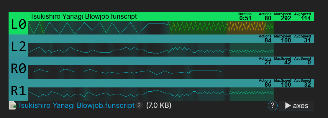
Currently, both the gradient and solid background options have poor visual accessibility. I didn’t mention the gradient one since it was already discussed multiple times in the past and the contrary feedback was always dismissed or ignored, so I don’t believe the sentiment would change now.
My hope, instead, was to suggest an easy change that would improve the legibility of the solid background option so that we have at least one option with good accessibility.
I cannot disagree with you. On my monitor they’re fine for me, but I also know my monitor is big and has very good contrast overall - that’s why I like to check the actual contrast ratios since they provide a more concrete number we can play around.
Of course, trusting contrast ratios blindly isn’t the best, but it’s usually a good baseline to find a minimum value.
I’m only really suggesting a change because it’s such a small one
Personally I think I would prefer dark solid background with white text, but this solution does provide contrast and is decent for visual clarity.
Or like, just dark solid background and black text with white outlines like the text in the gradient option.