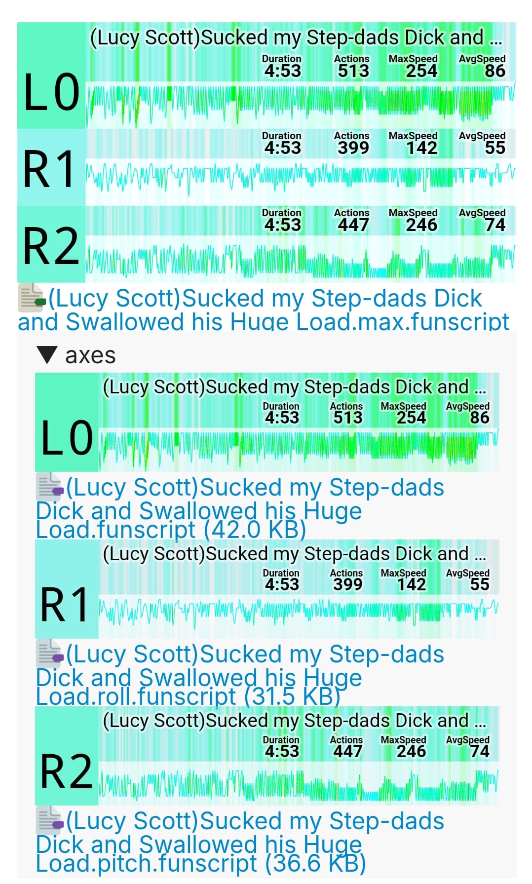
This depends on how the lines are represented, if its absolute lines, hand crafted scripts will show peaks at the 10 intervals and barely anything lower on. This would end up looking more like:

This is a meaningless view when we compare it to something that a generated script could generate:

This view is much clearer. But the question is mostly how this ‘evenness is created’. We could make each point look at values 10 above and below and average it there, which means it always includes the 2 most common values (the 10 intervals). But this could generate a very flat graph.
On the other hand, even if its that flat, if its a relative view between lowest and highest, it can still show a trend. And thats why i think such curve is better than absolute values.
But at least there is an easy method to measure. You keep track of all 0-100 positions, and each time the device crosses/stops at such point, add 1. In the end you get a value that represents activity. Sure, they can reach values up to 2500 easily in a 3000 node script, but thats fine. Its not going to exceed integer limits or go excessively high.
We then look at the lowest, (lets say that was 300), and remove this from all points (sets the 0 point for relative display). Next, we check the highest (lets say 2500), and we want to take this down to the limit value (lets say 100), and we then scale all points equal to that (val x 100/2500).
And now we can just display those values in a graph. There are not going to be peaks unless a vibration pattern happens to last long at for example 40-50. But we can counter this by using something like the OFS simplifier algorithm when detecting 10 consecutive strokes that each have a gap of 100ms after each other. This kills vibration patterns as it essentialy just removes all its points.
We could even intruduce the aspect of time in this. where slower strokes generate a higher value to add (1 second gives 100 weight, while 0.5s only gives 50).
Its highly unlikely we are going to run into integer issues if we only apply simple weights. And probably floats still provide enough precision (and i do consider that php is bad handling this! thats how little of an issue i see here).
The end result graphs that i expect will then be like:

Where in this example there is some base action going on, a little in the mid, but most action is at the tip, with again a peak at the upper point. The longer it stays at a region, the higher the bump. Note though, that even if the lower portion barely shows action, still over 50% of the strokes could pass it. Thats because we amplified the curve.